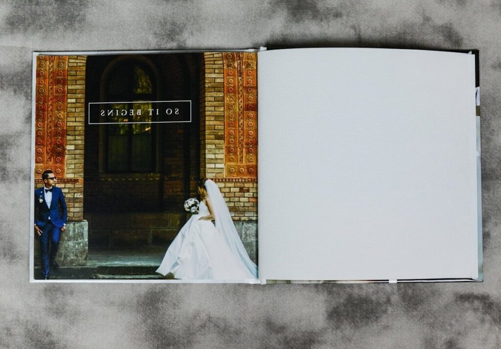

What Questions to Ask a Wedding Photographer Before Booking
Why You Need the Right Questions to Ask a Wedding Photographer Choosing a wedding photographer is one of the most important decisions you will make during your wedding planning journey. Your photos are what remain long after the cake is eaten and the flowers have wilted. Yet so many couples walk into a photographer consultation without a clear idea of what to ask, and end up regretting it later. This guide gives you a comprehensive, organized list of questions to ask a wedding photographer before you sign anything. We have grouped them into clear categories so you can walk into every consultation feeling confident, prepared, and ready to find the perfect match for your big day. Questions About Experience and Background Before anything else, you want to know who you are hiring. Experience matters, but so does personality and passion. Start here: How long have you been photographing weddings specifically? General photography experience is great, but weddings are a unique beast. How many weddings have you photographed in total? Have you shot at our venue before? If yes, ask to see sample galleries from that venue. Do you specialize in any particular type of wedding? (Outdoor, cultural, elopement, large-scale, etc.) Can we see two or three full wedding galleries? Not just highlight reels. Full galleries reveal consistency. Do you love what you do? This might sound casual, but their enthusiasm (or lack of it) tells you a lot. What drew you to wedding photography? Have you received any awards or industry recognition? Pro tip: Pay attention to how they describe past weddings. A photographer who speaks warmly about their couples is likely someone who genuinely cares about the work. Questions About Availability and Logistics Logistics can make or break a wedding day. Do not skip these practical questions: Is our wedding date available? Always confirm this first to avoid wasting anyone’s time. How far in advance do we need to book? How many other weddings will you photograph that same weekend? Will you personally be the one photographing our wedding, or could it be an associate? Will you have an assistant or second shooter with you? How many hours of coverage are included? What time will you arrive, and when do you typically wrap up? Are you willing to travel to our venue, and is there a travel fee? What will you wear on our wedding day? This matters more than you think, especially for formal events. Questions About Photography Style and Approach Style compatibility is crucial. You need to love the way your photographer sees the world. How would you describe your photography style? (Documentary, editorial, traditional, fine art, photojournalistic, etc.) Do you lean more toward posed portraits or candid moments? How do you handle group formal shots? Do they use a shot list? How do you approach low-light situations? (Receptions, evening ceremonies, indoor venues) How do you prepare for a shoot at a new location? What is your approach to directing couples who are camera-shy? Do you scout the venue beforehand? How do you capture details (rings, invitations, decor) without being disruptive? Questions About Pricing, Packages, and Contracts Money conversations can feel awkward, but they are absolutely necessary. Be direct and thorough. Question Why It Matters What packages do you offer, and what is included in each? Helps you compare apples to apples across photographers. What is your starting price for wedding coverage? Sets the baseline for your budget planning. Is there a charge for overtime if the day runs long? Prevents surprise fees on an already emotional day. What is the deposit amount, and is it refundable? Protects your finances if plans change. What is the payment schedule? Lets you plan payments alongside other wedding expenses. Are albums, prints, or digital files included, or are they add-ons? Some packages look cheap but lack deliverables. Can we customize a package to fit our needs? Flexibility is a sign of a client-focused photographer. Do you offer engagement session coverage, and is it included? An engagement shoot doubles as a trial run with your photographer. Also, always ask to see the contract before signing. Read every clause. Look for cancellation policies, image usage rights, and liability terms. Questions About Backup Plans and Equipment Things go wrong. Weather changes. Equipment fails. A professional photographer will have plans for every scenario. What happens if you get sick or have an emergency on our wedding day? Do you have a network of backup photographers you can call? What camera equipment do you use? Do you carry backup camera bodies and lenses? How do you back up our photos during and after the event? Do you have professional liability insurance? Many venues now require this. A photographer who hesitates on backup plan questions is a red flag. Full stop. Questions About Editing and Final Delivery The work does not end when the wedding day is over. Post-production is where your images truly come to life. What is your editing style? (Bright and airy, dark and moody, true to color, film-inspired, etc.) Can we request specific edits or color tones? How many final edited images can we expect? Will we receive sneak peeks, and how soon after the wedding? When will our full gallery be delivered? Industry standard is typically 4 to 8 weeks. In what format will the images be delivered? (Online gallery, USB drive, cloud download) Do we receive full printing rights? How long will our images be stored on your end? Do you offer black and white versions as well? A Note on Turnaround Times If a photographer promises your full gallery in under two weeks, ask how. Rushing edits can compromise quality. On the other hand, if turnaround stretches beyond 12 weeks, you might want to ask why. Questions About the Wedding Day Experience Your photographer will be by your side for most of the day. Make sure working together will feel natural. What is it like to work with you on the wedding day? How do you handle family
What Questions to Ask a Wedding Photographer Before Booking Read More »