Author name: Jose Moultry

Dusty Rose and Sage Green Wedding Color Palette: Design Ideas and Inspiration

Why the Dusty Rose and Sage Green Wedding Color Palette Is a Timeless Favorite Few color combinations feel as naturally romantic and elegant as dusty rose and sage green. This pairing blends the warmth of a muted pink with the earthy calm of a soft green, creating a palette that feels fresh yet timeless. Whether you are planning a garden celebration, a vineyard reception, or a classic ballroom affair, the dusty rose and sage green wedding color palette adapts beautifully to nearly every setting and season. In this comprehensive guide, we break down exactly how to weave dusty rose and sage green into every element of your wedding day, from the first save-the-date to the last dance. You will find styling tips, accent color suggestions, seasonal recommendations, and real inspiration you can act on right away as you plan your 2026 celebration. Understanding the Dusty Rose and Sage Green Color Palette Before diving into specific applications, it helps to understand why these two shades work so well together. Dusty rose is a muted, slightly grey-toned pink. It is softer than blush and more sophisticated than hot pink. Think of faded garden roses at sunset. Sage green is a grey-green reminiscent of dried herbs and eucalyptus leaves. It is calming, organic, and never overpowering. Together, they sit on opposite sides of the color wheel (pink vs. green), which gives the palette a natural sense of balance. The muted tones keep the contrast gentle rather than jarring, resulting in a look that is romantic, sophisticated, and nature-inspired all at once. Best Accent Colors to Pair With Dusty Rose and Sage Green While dusty rose and sage green are stunning on their own, layering in one or two accent shades adds depth. Here are the best companions: Accent Color Effect It Creates Best For Ivory / Cream Clean and classic Any season or venue Gold Warm glamour Ballroom, autumn, evening receptions Lavender Dreamy and whimsical Spring and summer garden weddings Soft Grey Modern and understated Urban loft or minimalist venues Terracotta / Earth Tones Boho warmth Desert, farm, or rustic celebrations Burgundy / Mauve Rich depth Fall and winter weddings Dusty Rose and Sage Green Wedding Florals Flowers are usually the most visible expression of a wedding color palette, and this combination gives florists a dream canvas to work with. Bouquet Ideas Bridal bouquet: Garden roses and ranunculus in dusty rose, mixed with eucalyptus, dusty miller, and sage-toned foliage. Add a trailing silk ribbon in ivory or sage for an organic finish. Bridesmaids’ bouquets: Smaller versions of the bridal arrangement, or single-variety bundles of dusty rose peonies wrapped in sage green ribbon. Boutonnières: A single spray rose bud in dusty rose backed by a sprig of seeded eucalyptus. Ceremony and Reception Arrangements Use lush greenery garlands (Italian ruscus, smilax, eucalyptus) down the aisle or across a ceremony arch, then tuck in clusters of dusty rose blooms at intervals. For centerpieces, mix tall taper candles in sage green holders with low, garden-style arrangements featuring roses, lisianthus, astilbe, and plenty of textured foliage. Hanging installations with cascading greenery and scattered dusty rose flowers work beautifully in barn or tent settings. Flowers That Naturally Come in Dusty Rose Garden roses (Quicksand, Sahara, Keira) Ranunculus Peonies (late spring availability) Astilbe Lisianthus Carnations (yes, they are making a stylish comeback) Sweet peas Bridesmaids Dresses in Dusty Rose and Sage Green One of the biggest decisions for this palette is whether to dress your bridal party in dusty rose, sage green, or a mix of both. All three approaches look stunning. Option 1: All Dusty Rose Dusty rose bridesmaids dresses photograph beautifully and flatter a wide range of skin tones. Pair them with sage green bouquets and greenery-heavy decor so both colors are still represented. Option 2: All Sage Green Sage green dresses feel fresh and modern. They look especially striking against dusty rose florals and warm metallic accessories. Option 3: Mix and Match Let each bridesmaid choose her shade. Alternate dusty rose and sage green down the line, or add in a soft mauve or champagne for a gradient effect. This approach feels relaxed, inclusive, and very on-trend for 2026 weddings. Styling tip: Keep shoes and jewelry in a consistent metallic family (gold pairs best with this palette) to unify the look regardless of dress color. Groomsmen and Groom Attire The groom and groomsmen can tie into the dusty rose and sage green wedding color palette in subtle but impactful ways: Suits: Light grey, tan, or warm taupe suits complement both colors perfectly. For a bolder choice, consider an olive or sage green suit for the groom. Ties and pocket squares: Dusty rose ties or sage green pocket squares add a direct color connection without overwhelming the look. Socks: A fun detail that shows during dancing. Choose sage green or dusty rose patterned socks. Tablescapes and Reception Decor The reception is where you can really immerse your guests in the dusty rose and sage green wedding color palette. Table Settings Linens: Ivory or white base tablecloths with sage green gauze runners or dusty rose napkins. Plates and chargers: Gold or clear glass chargers add elegance. Consider sage green salad plates for a pop of color. Glassware: Tinted sage green goblets or blush-colored champagne flutes elevate the place setting instantly. Candles: Taper candles in dusty rose or sage green, placed in brass or gold holders, create warmth as the evening unfolds. Larger Decor Elements Draping in sheer sage green or dusty rose fabric across ceilings, arches, or sweetheart table backdrops. Velvet lounge furniture in sage green or mauve for a cocktail hour seating area. Macramé or woven details for bohemian-style weddings. Lanterns, terracotta pots, or vintage brass vessels for a rustic feel. Wedding Stationery and Invitations Your stationery is the first glimpse guests get of your color palette, so it sets the tone for the entire event. Design Approaches Watercolor florals: Loose, hand-painted roses and greenery on a cream or white card stock. This is the most popular

Dusty Rose and Sage Green Wedding Color Palette: Design Ideas and Inspiration Read More »
How to Photograph Wedding Rings: Creative Ideas and Simple Techniques

How to Photograph Wedding Rings: Creative Ideas and Simple Techniques Wedding ring photos are some of the most treasured detail shots from any wedding day. Whether you are a professional photographer building your portfolio or a couple who wants to capture your own stunning ring images at home, knowing how to photograph wedding rings does not require expensive gear or a studio setup. In this practical guide, we cover everything from lighting and lens choices to creative compositions using florals, invitations, fabrics, and everyday props you probably already own. By the end, you will have a complete toolkit of ideas and techniques to create ring photos that feel editorial, romantic, and uniquely yours. Essential Gear for Wedding Ring Photography Before diving into creative setups, let’s talk about the tools that make a real difference. You do not need to spend a fortune, but a few key items will dramatically improve your results. Gear Why It Matters Budget-Friendly Alternative Macro lens (60mm-100mm) Captures fine details like engravings, stone facets, and metal texture Clip-on macro lens for smartphones or extension tubes Tripod or stable surface Eliminates camera shake for crisp, detailed shots Stack of books or a beanbag Reflector or white card Bounces light into shadows on the ring A piece of white paper or foil on cardboard Microfiber cloth Removes fingerprints and smudges before every shot Glasses cleaning cloth Putty or museum wax Holds rings upright in styled compositions Blu-Tack or a small piece of tape rolled sticky-side out Pro tip: Always clean the rings right before shooting. Even a tiny fingerprint becomes glaringly obvious in macro photography. Lighting: The Single Most Important Factor If there is one thing that separates a mediocre ring photo from a jaw-dropping one, it is lighting. Rings are small, reflective, and full of curves that catch every light source in the room. Here is how to control that to your advantage. Natural Light (The Best Starting Point) Window light is your best friend. Place your ring setup on a table near a large window with indirect sunlight streaming in. Avoid direct sun, which creates harsh reflections and blown-out highlights on metal. Shoot during the golden hour or on an overcast day for the softest, most flattering light. If the light from the window is too strong, hang a sheer white curtain or tape a piece of parchment paper over the glass to diffuse it. Use a white card or reflector on the opposite side of the window to fill in shadows. This is especially important for diamond rings where you want to show sparkle from multiple angles. Artificial Light Tips If natural light is not available, use a single continuous LED panel with a diffuser. Avoid using your camera’s built-in flash, which creates flat, unflattering reflections. A small LED light placed behind a glass of water can create beautiful refracted light patterns that add drama to your ring shots. When using artificial light, set your white balance manually to avoid color casts on metal. Camera Settings for Sharp Ring Photos Getting tack-sharp detail on an object this small requires some attention to your camera settings. Here is a reliable starting point: Aperture: Shoot between f/4 and f/8. While it is tempting to go wide open for bokeh, rings are three-dimensional, and a very shallow depth of field (like f/1.8) will leave parts of the ring out of focus. An aperture around f/5.6 gives you a beautiful background blur while keeping the entire ring sharp. ISO: Keep it as low as possible (100-400) to avoid noise that shows up in detail shots. Shutter speed: If shooting handheld, stay above 1/125s. If using a tripod, you can go much slower. Focus: Use manual focus or single-point autofocus targeted on the top of the stone or the front edge of the band. Autofocus can hunt on small reflective objects, so manual focus with magnified live view is often more reliable. File format: Shoot in RAW. The extra data gives you far more flexibility when adjusting exposure, white balance, and detail in post-processing. Smartphone users: Enable macro mode or portrait mode. Many flagship phones in 2026 offer dedicated macro lenses. Tap to focus on the ring, lock the exposure, and use a 2-second timer to avoid shaking the phone when pressing the shutter button. 12 Creative Ideas for Stunning Wedding Ring Photos Now for the fun part. Below are twelve tested compositions that range from classic to creative. Mix and match these ideas to build a diverse gallery of ring detail shots. 1. The Classic Flat Lay Place the rings on a clean, textured surface like linen fabric, handmade paper, or a marble tile. Arrange supporting elements around them: the invitation suite, a sprig of eucalyptus, a ribbon, and perhaps perfume or the vow booklet. Shoot from directly above for a clean, editorial look. Styling tip: Keep colors within a tight palette (no more than 3 tones) so the rings remain the focal point. 2. Nestled in Florals Place the rings on top of or inside a bouquet of fresh flowers. Roses, peonies, and ranunculus work beautifully because their layered petals create a soft, romantic bed for the rings. This adds a gorgeous pop of color and organic texture. 3. On a Reflective Surface A mirror, a glass table, or even a polished dark tile creates a stunning reflection beneath the rings. This doubles the visual impact and gives the image a high-end, editorial feel. Use a dark background behind the rings to keep the composition clean. 4. Inside the Ring Box Do not overlook the ring box itself. A velvet ring box in a rich jewel tone (emerald, navy, burgundy) provides a beautiful contrast to gold or platinum bands. Shoot both open and partially closed for variety. 5. On the Wedding Invitation or Vow Card Placing rings on printed text, especially the couple’s names or wedding date, tells a story. The lettering adds a personal, meaningful layer to the image. Use a shallow depth of field to

How to Photograph Wedding Rings: Creative Ideas and Simple Techniques Read More »

How to Design a Sticky Header That Improves UX: Best Practices and Examples

What Is a Sticky Header and Why Does It Matter? A sticky header is a navigation bar that remains visible at the top of the screen as users scroll down a page. Instead of disappearing when visitors move past the first viewport, the header “sticks” in place, giving constant access to navigation links, search, branding, and calls to action. When done right, sticky header design reduces friction, keeps users oriented, and shortens the path between intent and action. When done poorly, it eats up screen real estate, tanks performance, and frustrates mobile users. This guide walks you through everything you need to know to implement a sticky header that genuinely improves the user experience in 2026 and beyond. Sticky Header vs. Fixed Header: What Is the Difference? These two terms get used interchangeably, but they behave differently in the browser. Understanding the distinction matters for both design and development. Feature Sticky Header (position: sticky) Fixed Header (position: fixed) Behavior before scroll Acts like a normal element in the document flow Removed from the document flow immediately Behavior during scroll Sticks once you scroll past its natural position Always stays at the defined position Respects parent container Yes. Won’t scroll beyond its container No. It is relative to the viewport only Layout shift on load None (stays in flow until activated) Can cause content to jump unless offset is added Best use case Main site headers, section headers, table headers Persistent toolbars, chat widgets Bottom line: For most website headers in 2026, position: sticky is the better choice. It is more predictable, causes fewer layout issues, and plays nicer with other page elements. When Should You Use a Sticky Header? A sticky header is not always the right call. Here is a quick decision framework: A sticky header is a good idea when: Your pages are long and content-heavy (blogs, e-commerce catalogs, documentation sites). Navigation is critical to the user journey (SaaS dashboards, multi-step flows). You want persistent access to search, cart, or a primary CTA. Your analytics show users frequently scroll back to the top. You might skip it when: The page is short and everything fits in one or two viewports. You are building an immersive, full-screen experience (portfolios, storytelling pages). The header is very tall and would consume too much vertical space, especially on mobile. CSS Techniques for Sticky Header Design Let’s get practical. Here are the core CSS approaches you should know. 1. The Basic Sticky Header This is the simplest implementation and works in all modern browsers. header { position: sticky; top: 0; z-index: 1000; background-color: #ffffff; } That’s it. The header will sit in its normal position until the user scrolls past it, then it locks to the top of the viewport. The key properties: position: sticky activates the behavior. top: 0 tells the browser where to stick it. z-index makes sure it layers above page content. background-color prevents content from showing through. 2. The Shrinking Header A popular pattern where the header reduces in height once the user starts scrolling, giving back vertical space. header { position: sticky; top: 0; z-index: 1000; padding: 20px 0; transition: padding 0.3s ease; } header.scrolled { padding: 8px 0; box-shadow: 0 2px 8px rgba(0, 0, 0, 0.1); } You toggle the .scrolled class with a small JavaScript snippet that listens to the scroll event (more on performance later). 3. The Show-on-Scroll-Up Header This approach hides the header when the user scrolls down and reveals it when they scroll up. It is excellent for mobile because it maximizes content space while keeping navigation one flick away. header { position: sticky; top: 0; z-index: 1000; transform: translateY(0); transition: transform 0.3s ease; } header.hidden { transform: translateY(-100%); } The JavaScript tracks scroll direction and applies or removes the .hidden class accordingly. Important CSS Gotcha position: sticky will not work if any ancestor element has overflow: hidden, overflow: scroll, or overflow: auto set. This is one of the most common reasons sticky headers fail silently. Always check the parent chain if your sticky header refuses to stick. Mobile Considerations for Sticky Headers Mobile is where sticky header design gets tricky. Screen real estate is limited, touch interactions differ from mouse behavior, and browser chrome (address bar, bottom nav) already competes for space. Rules for mobile sticky headers: Keep the height under 60px. Anything taller and you start losing too much content area. On a 700px tall mobile viewport, a 100px header steals over 14% of the screen permanently. Use the show-on-scroll-up pattern. This is arguably the best approach for mobile. Users get full content when reading and instant access to navigation when they change direction. Collapse secondary navigation. On desktop you might show full menu items. On mobile, reduce to a logo, a hamburger icon, and maybe one primary CTA button. Test with the virtual keyboard open. On Android and iOS, the on-screen keyboard can push sticky elements around. Make sure form interactions below the header still work correctly. Account for 100vh issues. Mobile browsers have dynamic toolbars that change the actual viewport height. Use 100dvh (dynamic viewport height) instead of 100vh when combining sticky headers with full-height sections. Scroll Behavior and JavaScript Performance If your sticky header involves JavaScript (for shrinking, hiding, or changing state on scroll), performance matters. Scroll events fire rapidly, and poorly optimized listeners can cause visible jank. Best practices: Use IntersectionObserver instead of scroll listeners when possible. For example, place a hidden sentinel element at the top of the page and observe when it leaves the viewport. This is far more efficient than listening to every scroll pixel. If you must use scroll events, throttle them. Use requestAnimationFrame or a throttle function to limit execution to once per frame (roughly 16ms). Avoid layout-triggering properties in scroll handlers. Reading offsetTop, getBoundingClientRect(), or similar properties forces the browser to recalculate layout. Batch these reads if needed. Prefer CSS transitions over JavaScript animations. GPU-accelerated properties like transform and opacity are much cheaper than animating height or padding directly. Example:

How to Design a Sticky Header That Improves UX: Best Practices and Examples Read More »

pixel art

Custom Pixel Art vs. Vector Art: Which Style is Right for Your Brand?

Choosing the right visual style for your brand can significantly impact how it’s perceived by your audience. Two popular design styles—custom pixel art and vector art—each offer unique aesthetic qualities that can communicate different messages. Whether you’re rebranding or creating a new visual identity from scratch, understanding the difference between pixel and vector art is key to making an informed decision. Both styles have their strengths, but which one is right for your brand? Let’s break down the characteristics of custom pixel art and vector art, explore their respective pros and cons, and help you determine which style is the best fit for your business. What Is Pixel Art? Pixel art is a digital art form where images are created and edited at the pixel level. Each pixel is a single point of color, and the overall image is built by carefully arranging these tiny squares to create larger shapes and designs. This style has a distinctly retro, low-resolution look, which has made it popular in video games, especially during the 8-bit and 16-bit eras. Pixel art tends to evoke nostalgia, as it harkens back to classic video games like “Super Mario Bros.” or “The Legend of Zelda.” Its charm lies in the simplicity and precision required to create recognizable characters and scenes using a limited number of pixels. For many brands, pixel art’s playful, vintage aesthetic can strike an emotional chord with audiences. What Is Vector Art? Vector art, on the other hand, is created using mathematical equations rather than individual pixels. This allows for infinitely scalable images without any loss of quality. Whether you zoom in or out, vector graphics maintain their crispness, making them ideal for both small icons and large-scale prints like billboards. Unlike pixel art, vector art is often clean, modern, and polished, which makes it versatile across many industries. It’s commonly used in logo design, illustrations, and infographics. Vector-based designs can be resized easily without worrying about distortion, making them perfect for brands looking for a sleek, professional look. The Pros and Cons of Pixel Art Pros: Nostalgic Appeal: Pixel art taps into the retro aesthetic, making it a great choice for brands that want to evoke nostalgia. This is especially true if your target audience has an affinity for old-school video games or digital art from earlier technological eras. Unique Style: Pixel art has a distinct, low-resolution charm that’s hard to replicate in other styles. Its unique look can help your brand stand out, especially in industries that value creativity and playfulness. Budget-Friendly: Compared to other forms of custom illustration, pixel art can sometimes be more cost-effective. Its low-resolution nature often means less complexity in production. Cons: Limited Flexibility: Because pixel art is based on tiny squares of color, scaling up a pixel-based image can result in noticeable distortion or blurring. If your brand needs high-res designs for larger formats like posters or banners, pixel art may not be ideal. Niche Audience: While pixel art is beloved by certain audiences, particularly gamers and tech enthusiasts, it may not resonate as well with all demographics. If your brand’s appeal is more mainstream or corporate, this style might feel out of place. The Pros and Cons of Vector Art Pros: Scalability: Vector art is infinitely scalable without losing quality. This is a massive advantage for brands that need their logos or visuals to appear crisp on both business cards and huge billboards. Modern and Clean: Vector art typically has a sleek, polished look, which can communicate professionalism, modernity, and reliability. It works well for businesses that want a contemporary, forward-thinking brand identity. Versatility: Whether you need illustrations for web, print, merchandise, or digital advertising, vector art is adaptable to virtually any medium. Its flexibility makes it a popular choice for brands across various industries. Cons: Less Character: While vector art excels in clarity and professionalism, it can sometimes feel less personal or whimsical compared to pixel art. It lacks the handmade, nostalgic charm of pixel art, which may be a downside for brands looking to evoke a sense of warmth or playfulness. Higher Cost: Custom vector illustrations, especially detailed or complex ones, can be more expensive to produce. They may require more time and skill, which can drive up design costs for your brand. When to Choose Custom Pixel Art Pixel art could be the right choice for your brand if you’re targeting a niche audience that appreciates retro aesthetics or gaming culture. If your brand’s personality is quirky, creative, and not afraid to stand out with something unconventional, pixel art can help you connect with your audience in a fun, authentic way. This style works particularly well for indie game developers, tech startups with a playful edge, or brands catering to young, digitally savvy customers. The nostalgic vibe of pixel art can spark emotional connections and convey that your brand is rooted in creativity and innovation. When to Choose Vector Art For businesses that need versatility, professionalism, and scalability, vector art is often the best fit. If your brand operates in a more formal or corporate space—such as finance, technology, or healthcare—a clean, modern vector design will help you communicate trust and credibility. Vector art is also ideal for brands that need consistent quality across various media. From website icons to large banners, a vector-based design will always look sharp. It’s particularly useful for businesses that require frequent resizing of their graphics or logos. Making the Right Choice for Your Brand Ultimately, the decision between custom pixel art and vector art boils down to your brand’s personality, audience, and needs. Pixel art offers a distinct, retro aesthetic that’s ideal for brands looking to differentiate themselves with a fun, nostalgic vibe. On the other hand, vector art provides a clean, modern look that offers flexibility and scalability, making it a solid choice for brands with broader or more formal appeal. Before making your final decision, consider how each style aligns with your brand’s message and the type of emotional response you want to elicit

Custom Pixel Art vs. Vector Art: Which Style is Right for Your Brand? Read More »

logo design

Comparing DIY vs. Professional Logo Design: Which Is Best for Your Brand?

Choosing the right logo for your brand is a significant decision that can impact your business’s identity and success. A logo is often the first thing potential customers see, and it represents your brand’s values and personality. When it comes to logo design, you have two primary options: DIY (Do It Yourself) or hiring a professional designer. Each approach has its advantages and drawbacks. Let’s compare DIY vs. professional logo design to help you decide which is best for your brand. Understanding DIY Logo Design DIY logo design involves creating your logo using online tools and software without the help of a professional designer. This option is popular among startups and small businesses due to its accessibility and cost-effectiveness. Pros of DIY Logo Design: Cost-Effective: One of the most significant advantages of DIY logo design is the cost savings. Online tools and software are often free or available at a low cost, making this an attractive option for businesses with limited budgets. Creative Control: Designing your logo allows you to have complete control over the creative process. You can experiment with different styles, colors, and fonts until you find the perfect fit for your brand. Immediate Results: DIY logo design tools offer instant results. You can create and finalize your logo quickly without waiting for a designer’s availability or turnaround time. Cons of DIY Logo Design: Limited Design Skills: Most business owners lack the professional design skills needed to create a high-quality logo. This can result in a logo that looks amateurish and fails to effectively represent your brand. Generic Templates: Many DIY tools use generic templates that can lead to a logo that lacks originality. There’s a risk that your logo may look similar to others, reducing its uniqueness and impact. Time-Consuming: Designing a logo yourself can be time-consuming, especially if you’re not familiar with design principles and tools. This time might be better spent on other aspects of your business. Understanding Professional Logo Design Hiring a professional logo designer means entrusting your logo creation to an expert who has the skills and experience to create a unique and impactful logo tailored to your brand. Pros of Professional Logo Design: High-Quality Design: Professional designers have the expertise to create high-quality logos that effectively represent your brand’s identity. They understand design principles, color theory, and typography, ensuring a polished and professional look. Unique and Custom Designs: A professional designer can create a custom logo that stands out and is tailored specifically to your brand. This uniqueness helps in building a strong brand identity and recognition. Expert Insights: Professional designers offer valuable insights and advice based on their experience. They can guide you on the best design choices and ensure your logo is versatile and effective across different mediums. Cons of Professional Logo Design: Higher Costs: Hiring a professional designer can be expensive, especially for small businesses or startups with limited budgets. However, this investment often pays off in the long run with a strong, effective logo. Longer Turnaround Time: Working with a professional designer may take longer compared to using a DIY tool. The process involves consultations, revisions, and final approvals, which can extend the timeline. Less Control Over Design Process: While professional designers strive to meet your vision, there is less direct control over the design process compared to DIY. Effective communication and collaboration are essential to ensure the final design aligns with your brand. DIY vs. Professional Logo Design: Making the Right Choice When to Choose DIY Logo Design: Budget Constraints: If your budget is extremely limited, a DIY logo can provide a cost-effective solution to get your brand started. Quick Turnaround Needed: If you need a logo quickly and are willing to compromise on quality, DIY tools can deliver immediate results. Simple Requirements: For very simple logos where brand differentiation is not critical, DIY might suffice. When to Choose Professional Logo Design: Brand Differentiation: If standing out from the competition is crucial, a unique, professionally designed logo is essential. Long-Term Investment: If you view your logo as a long-term investment in your brand’s identity, the higher cost of professional design is justified. Complex Requirements: If your logo needs to convey complex brand values or work across various media, professional design expertise is necessary. Conclusion Deciding between DIY and professional logo design depends on your specific needs, budget, and goals. While DIY logo design offers cost savings and immediate results, it often lacks the quality and uniqueness that a professional designer can provide. On the other hand, professional logo design involves a higher upfront cost and longer turnaround time but results in a high-quality, unique logo that effectively represents your brand. By carefully considering your branding needs and resources, you can make an informed decision that will help you create a logo that enhances your brand’s identity and success.

Comparing DIY vs. Professional Logo Design: Which Is Best for Your Brand? Read More »

Logo design

Popular AI Powered Logo Makers and Their Features

Nowadays creating a logo for a company, business, or group is as easy and affordable as ever thanks to the existence of many AI powered software or tools that can develop and design appealing and effective logos in no time and for a good price. These AI powered apps and programs can be found online, meaning that even brand-new entrepreneurs will be able to benefit from such services depending on their suits, preferences, and budget of operation. However, it is important to know that there are lots of AI powered logo makers, meaning that it is easy to select the wrong option that does not offer the wanted results. That is why knowing the next logo design software with their features is crucial to make the correct choice. Popular AI Powered Logo Makers and Their Features: Logomaster: Excellent for startups, small businesses, and even professionals as it is a platform that can reduce costs since it is a lot cheaper than hiring professional logo designers, and the results are as good as possible. The generator offers over 100 templates that can be selected depending on the chosen plans. The basic plan offers normal-resolution logo files for $15 and the premium plan offers high-resolution files for $35. Brandmark: This AI powered logo maker is interesting as there are thousands of ready-to-use assets that can let you customize your logo for free after obtaining the results, and the fact that you can do everything online without having to download any software is a good feature. Offers easy editing, quick export, and all possible formats with unlimited revisions, convenient text and so much more. Starting from $25 to $175 in different plans. Logo AI: This is a smart option as it combines data and designs best practices that produce unique and beautiful logos that can be used for all professional usages. It is a professional tool that produces results that can match the ones made by humans. It follows brand guidelines and all kinds of logo formats, and the fact that it always creates a new logo instead of using templates means that the results are unique. It is simple to use as all that is required is entering the brand name, any design specifications, and then the platform will provide endless possibilities of customization by changing layouts, colors, fonts, symbols and so much more. Shopify Hatchful: Shopify is one of the most popular platforms for eCommerce and pretty much everyone who is into this type of business knows about it. However, they have an AI powered logo maker called Hatchful, which proves to be a powerful tool that lets you customize and design a company logo with all of your preferences in simple steps that do not require too many interactions. Hatchful offers many benefits such as ready to use templates, time saving processes accessible social media assets that are trending at the moment, design studio for logo creation, a brand recognition builder, and even easy to use customization tools.

Popular AI Powered Logo Makers and Their Features Read More »

PIxel Art

Why Pixel Art Is Seeing A Rennaissance

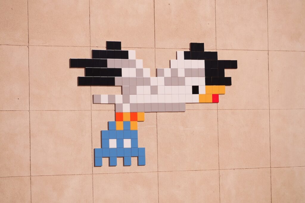
Graphic design and art trends come and go. It’s always fun trying to discover what’s next down the trendline but it seems like all signs point to pixel art becoming the next big thing.  Before we talk about the pixel art renaissance, let’s first talk about what pixel art is first. Defining Pixel Art People define pixel art as a form of digital art where the images are created and edited at the pixel level. This can be done using graphics editing software but there are artists who are skilled enough to create pixel art using solely their hands. It’s a unique and colorful form of art that’s taking the world by storm, pixel by pixel. The idea of pixel art originated from the stylings of video games during the 70s-90s. Games like Galaga, The Legend of Zelda, Super Mario Bros., and many others were presented in pixels. Despite being outdated, pixel art can’t seem to die out. Now, it continues to become a great source of design and inspiration for many. Why Is It Becoming More Popular Today? The pixel art renaissance isn’t just rising on its own. Its emergence is likely caused by the popularity of nostalgic media. Over the last couple of years, media like Stranger Things, retro-style games, legacy movies, Cobra Kai, and many others have elicited a feeling of nostalgia in the general populous. Among those included in this feeling of nostalgia is pixel art of course. The emergence of these has made pixel art more trending. This is why you often see them in marketing materials, TV, movies, and so much more. Even some modern video games are being created with this art style in mind. Perhaps another reason why pixel art is becoming popular is that it’s an art form that’s easy to make using today’s tools and software. There are even some online tools that will allow you to turn images and regular art into pixelized masterpieces in just a few clicks. What Does This Mean For Marketers? To put it simply, this renaissance of pixel art means that there’s a prime opportunity for marketing using these types of design. There are some businesses that already rely on nostalgic marketing media to get more attention from their audience. Pixel art could get bigger within the next couple of months or years. As long as people have a yearning for the days gone by, it’s impossible to see this trend change so instantly.

Why Pixel Art Is Seeing A Rennaissance Read More »